We have created an online documentation to share components and guidelines with designers and developers.
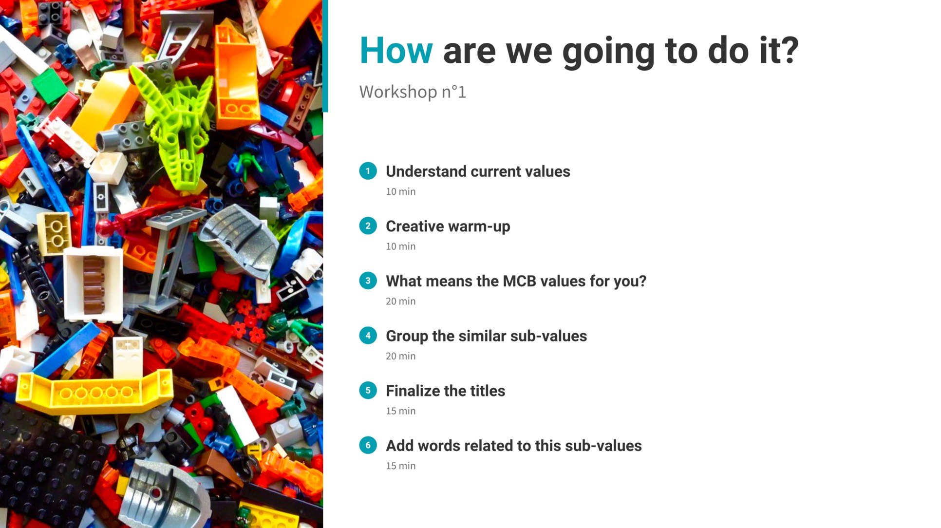
Summary of the first workshop for the creation of design principles based on the bank's values.
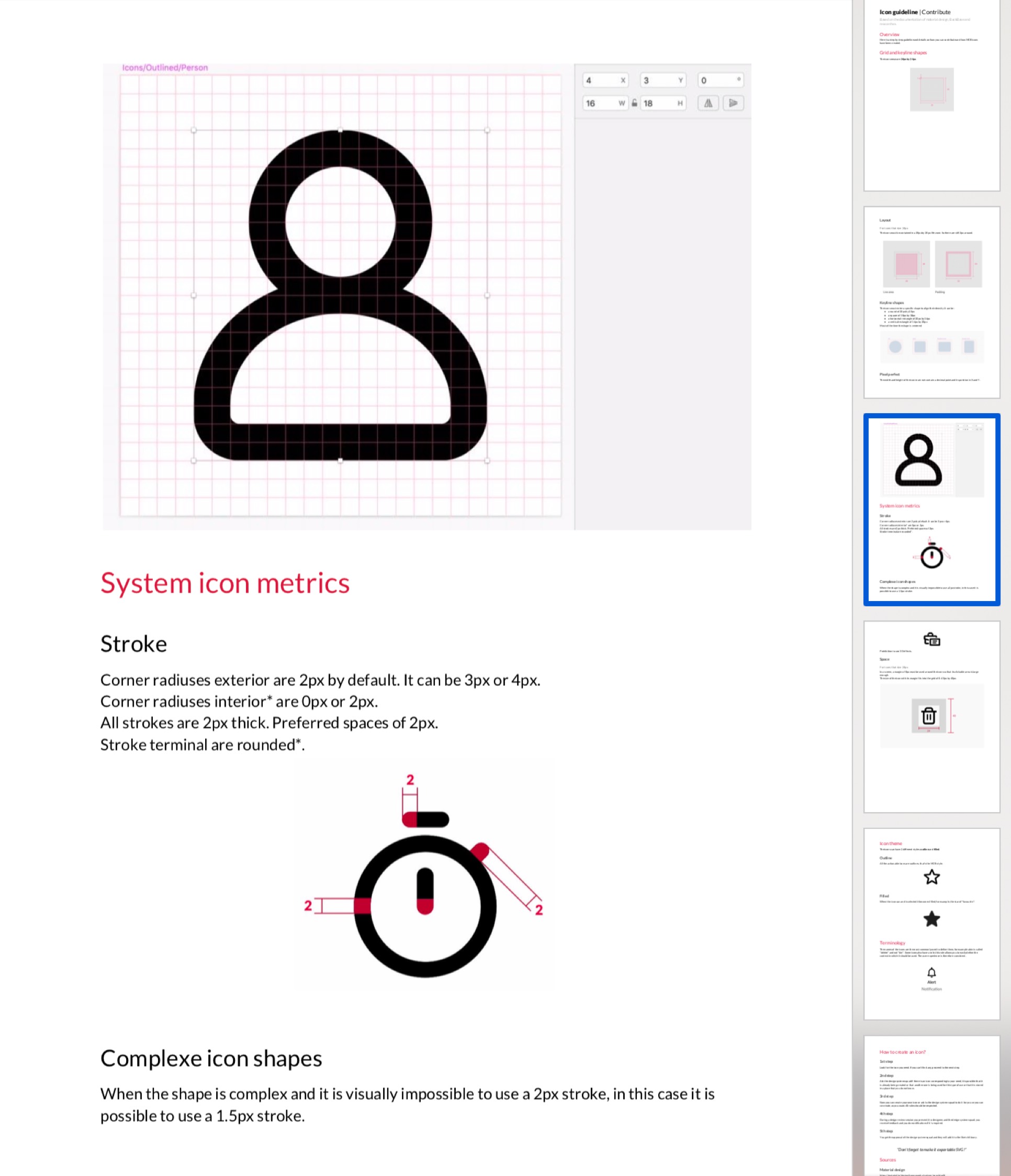
Here is a sample guideline to help designers create their own icons.
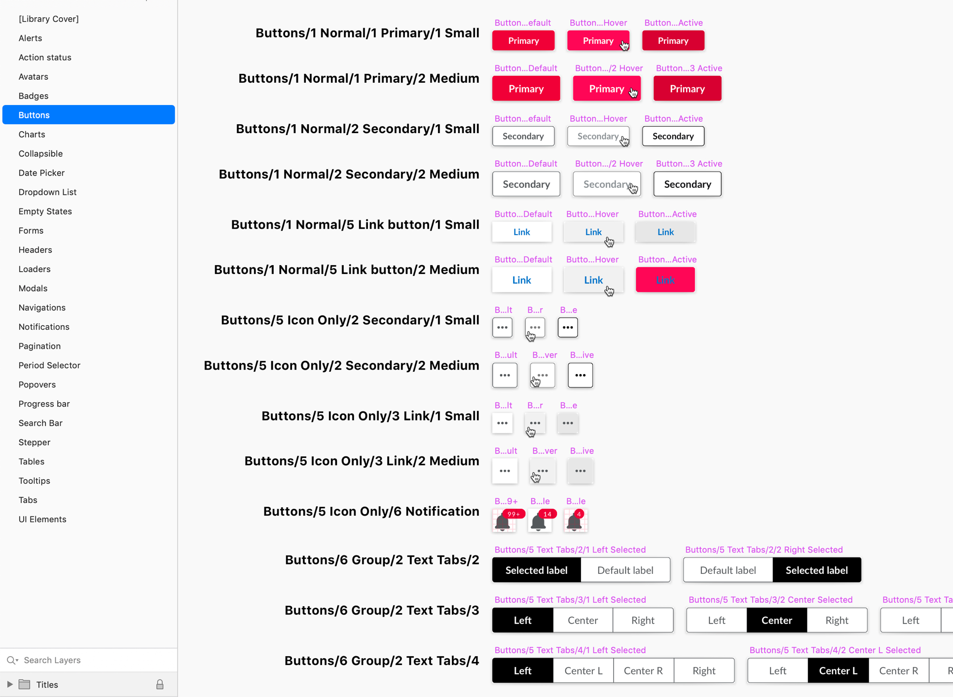
Here is the buttons page of the Sketch library, including even an error!
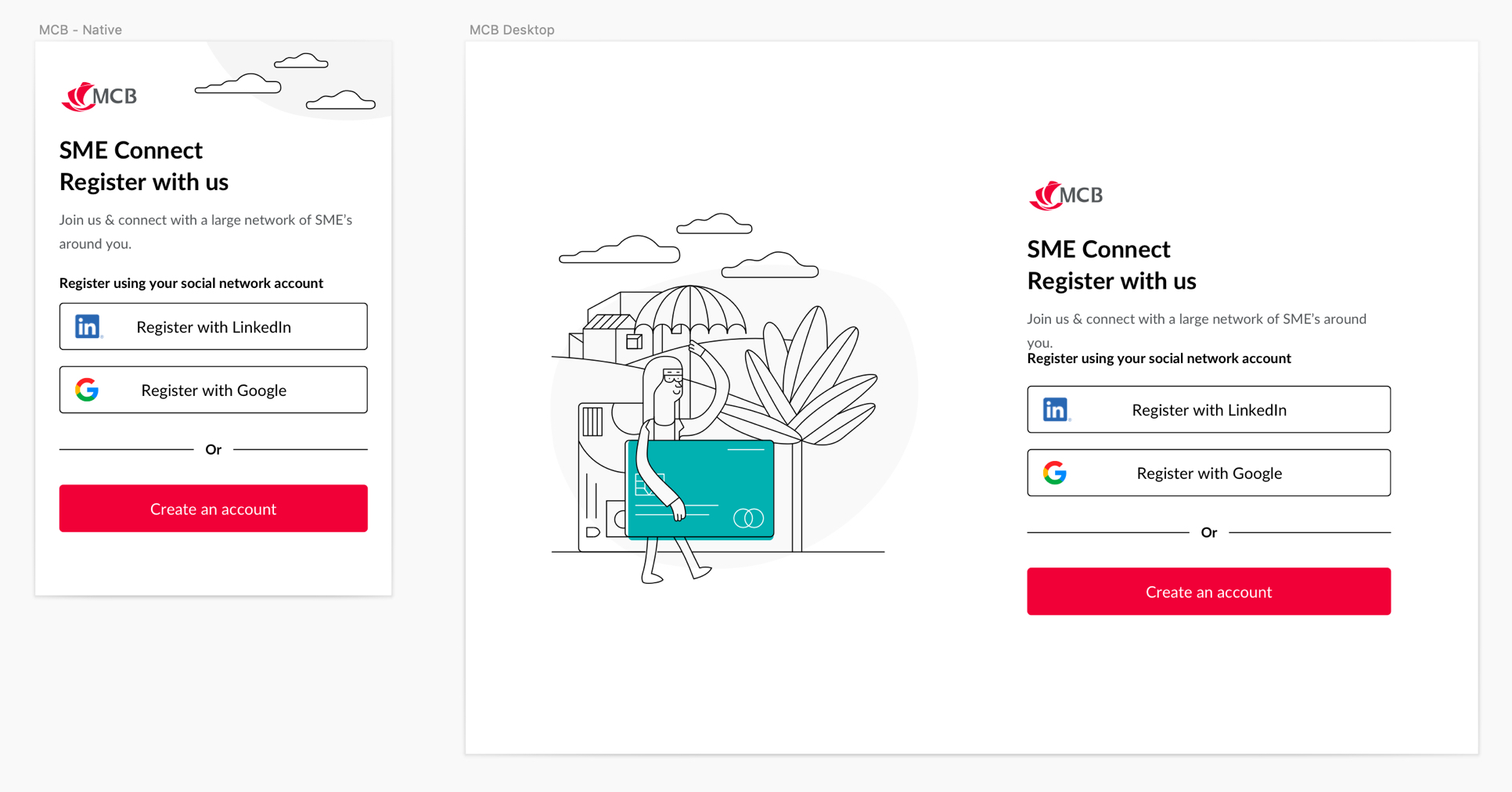
Here is the login page in desktop and mobile version.
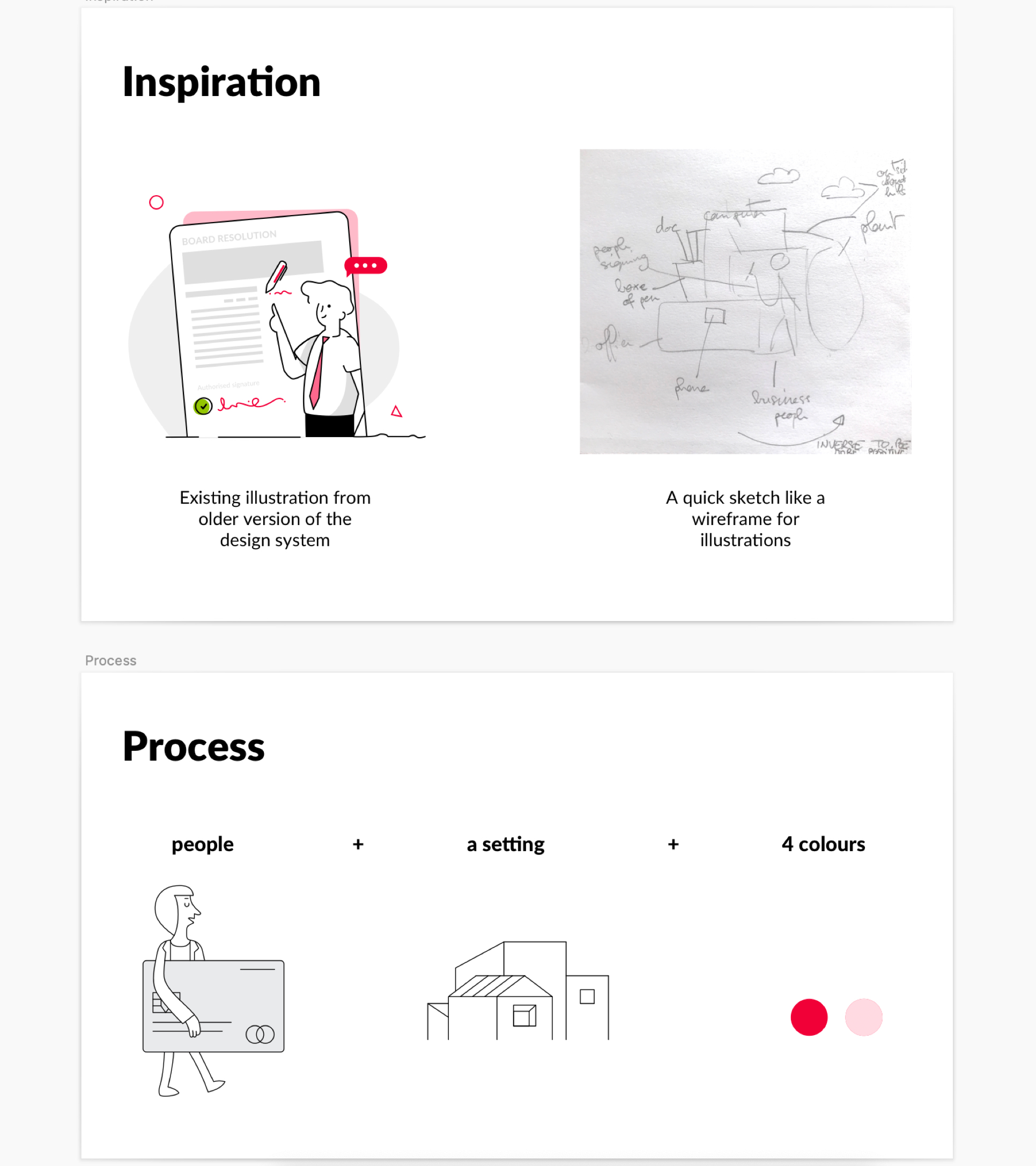
Here is the process that I propose and continue to improve to use the illustration design system.
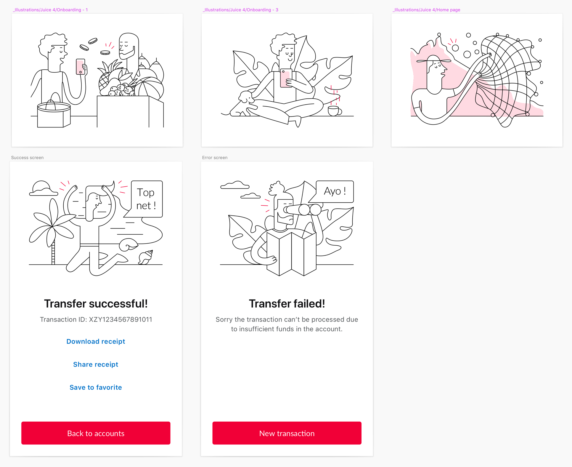
Here are some illustrations and some screens I made.
January, 2019
MCB Design System
Client
Mauritius Commercial Bank
My role
UI designer, responsible for the design system
My mission
Create a Sketch library and an alignment process for designers
Project
Create a design system to align the designs of all digital factory apps
Team
1 designer and 1 lead designer
Challenges met and solutions found
Version 1
- The designers were not available to answer my questions about their designs.
- I asked the designers to provide me with as many screens as possible, I selected 75 of them, I made an audit of the colors, of each component in them, and this served as a basis for my work.
- The designers felt it was disturbing that the design system library was updated almost every day.
- I stopped doing daily updates, I did them every week.
- The designers needed responsive components, which was not the case.
- I transformed all the existing components to become responsive. I also created a grid based on the Bootstrap data and gave a course to the designers to explain how to use it.
- The designers wanted to contribute to the design system but didn't have the time.
- I organised a weekly meeting to show the evolution of the design system and ask for feedback.
- The designers didn't want to change their existing design because it would break the many screens they had already created.
- I proposed to make the design system available for those who wanted to use it, at the beginning it was not mandatory and it should not be a constraint for them but a help.
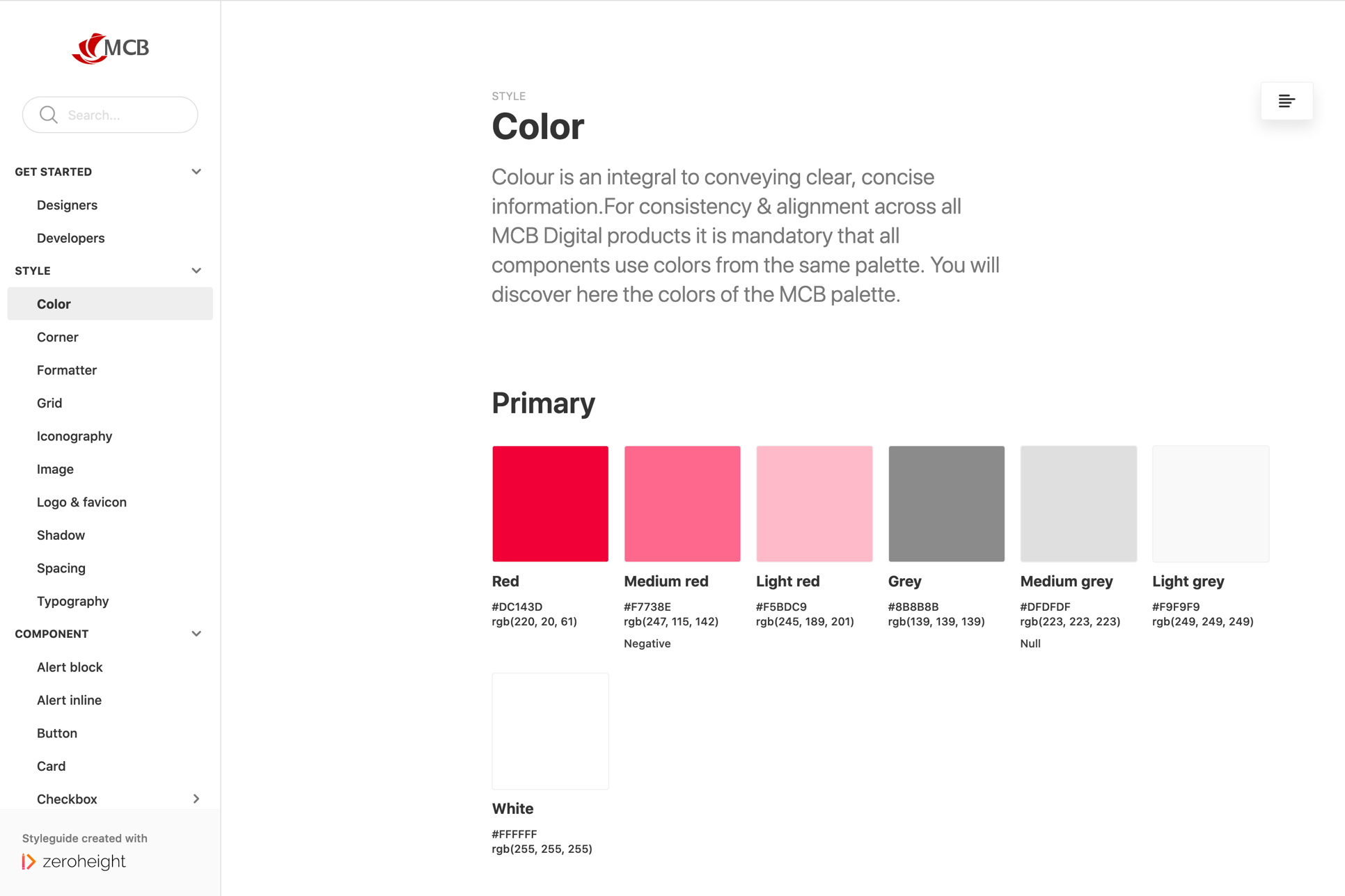
- The red of the logo used as primary color could be considered as an error.
- We had long discussions about this and we decided that red as the primary colour would be used sparingly and the red of the errors would be the same because after a few tests the difference was too small.
- The titles took up too much space on the screen because they were always on two lines.
- The whole style of the design system was based on these two title lines, so I kept the two lines but reduced the fonts.
- The lines and sizes of the icons were not the same everywhere.
- I re-designed all the icons with the help of my colleague and create guidelines.
Version 2
- Designers can't agree on the basics to make a decision.
- I created and organized 5 workshops with all the designers from the factory and some from marketing to create design principles, allowing us to have a common base that we could all agree on.
- The design of the new multi-channel tool set up at MCB is not aligned with the existing design.
- After long discussions the lead designer and myself agreed that we should take the new tool as a base and add our style to it, so that's what I did.
- The success green was not readable when used with a typeface.
- I proposed several darker greens to match the red of the logo and asked the designers to vote, the one that received the most votes was selected.
Version 3
- The empty states icons are magnified to be more visible, the thickness is not the same and the design is too basic.
- We needed illustrations, so I created a design system for the illustrations including a process to make it easier for designers to use. We asked a Mauritian illustrator who had previously worked for MCB if he would be ok with us borrowing his style for our design system and he agreed. So I used his style to create new illustrations.
- The login pages of the different apps are not the same.
- With my colleague we created a login page for everyone based on the grids we had for Desktop, Tablet, Mobile, IOS and Android.